TL;DR

Get home appliances delivered free with Prime
- Fast, free delivery on millions of items
- Prime Video, Amazon Music and more included
- Member-only deals all year
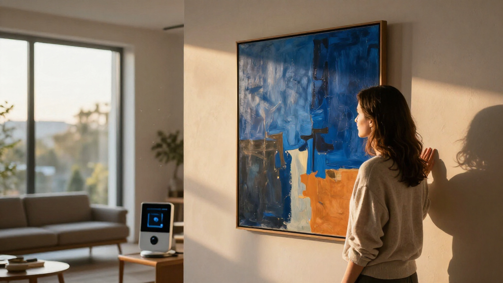
Art in the home may influence mood through color, shape and associations, according to art historian Susie Hodge and decorator Cameron Jones. They stress that reactions are personal: a work that calms one person may unsettle another, so choosing art should start with how residents want a space to feel.
Artwork at home may shape how residents feel through its colors, forms and personal associations, art historian Susie Hodge and decorator Cameron Jones told Veranda. Their accounts suggest that art can be used to support a desired mood in a room, but they do not establish a universal emotional effect: individual reactions vary.
Hodge, author of How Art Can Change Your Life, said that seeing art a person finds pleasing can trigger a dopamine response. She compared the strongest positive reaction to euphoric feelings associated with love. The report presents this as Hodge’s explanation of art’s emotional pull, not as a clinical finding quantified in the article.
Jones said she asks clients how they want to feel in a room before making design choices. In bedrooms, she suggested that greens, blues and neutral shades such as cream, white and taupe can support a calm atmosphere. A breakfast room intended to feel lively might use yellow, while red or orange artwork could bring warmth and energy to a dining area. Art can introduce color without requiring a brightly painted wall, she said.
The experts also discussed form. Jones said her clients tend to feel calmer around abstract works with rounded shapes and softer lines. Hodge described soft colors, smooth lines, circles and horizontal emphasis as qualities that can feel peaceful; sharp angles, jagged lines and bold patterns may feel more stimulating, but can also make some viewers anxious or angry. These are tendencies they have observed, not rules that predict every viewer’s response.
Choosing Art for the Mood of a Room
The practical point for homeowners is that art can be part of a room’s emotional character, not simply a finishing decoration. Someone looking for a restful bedroom might choose work with soft colors and flowing shapes, while a person who wants a more energetic gathering space could select brighter colors or stronger contrasts. The experts’ advice offers a way to think about those choices without treating any palette as a guaranteed mood-setting tool.
Personal preference remains central. A work that feels peaceful to one person might recall an unpleasant memory for someone else, Hodge said. That means the same design choice can land differently across household members and visitors. In Jones’s view, the art people live with should reflect what makes them feel comfortable and happy, rather than follow a single formula for an attractive home.
Products Worth Considering

Dyson Big Ball Multi Floor Canister Vacuum, Yellow

Philips Hue Smart LED Candle Bulbs, B39, E12, White and Color Ambiance, 2-Pack

Philips Hue Secure Starter Kit with Contact Sensors, Motion Sensor, Bridge, and Color Smart Bulbs
As an affiliate, we earn on qualifying purchases.
Color and Form in the Home
The Veranda report illustrates its points with artists whose work uses color in distinctive ways. Hodge said Agnes Martin sought to replace stressful feelings with calm, positive thoughts, and described Martin’s blue painting Night Sea, held by the San Francisco Museum of Modern Art, as intended to elicit an uplifting response. The account describes the artist’s intention; it does not establish that every viewer experiences the painting in the same way.
Hodge also cited Henri Matisse’s belief in color’s effect and Mark Rothko’s interest in expressing basic human emotions through large fields of layered pigment. Rothko, she said, noted that some viewers cried in front of his paintings. These examples show how artists have thought about the emotional force of color, while the report’s central qualification is that viewers bring their own experiences to what they see.
““When we see art that we find pleasing, it gives us a dopamine rush.””
— Susie Hodge, art historian and author of How Art Can Change Your Life
Why Reactions Differ Between Viewers
The report offers expert observations and examples, but the supplied material does not describe a study measuring how specific artworks affect people across a representative group. It gives no numerical estimates for the effects of particular colors or shapes, and it does not establish that a particular painting will reliably calm, energize or upset someone.
Hodge and Jones both stress that interpretation depends on personal experience. The report also does not explain how factors such as lighting, room size, culture or a viewer’s current mood might change a response. Its suggestions are best understood as starting points for choosing art, rather than evidence-based guarantees about emotional outcomes.
Testing Art Choices at Home
The experts’ advice points toward a simple next step for readers: decide what they want a room to feel like, then pay attention to their own response to the art they consider. A person can compare colors and forms, consider the memories a work brings up, and see how it feels in the room before making a lasting choice. The report identifies no formal follow-up study or announced next milestone.
For households with differing tastes, the emphasis on individual response suggests discussing which works feel welcoming to the people who use the space. The source does not offer a universal selection method. Its final guidance is personal: choose art that feels right to the people who live with it, while recognizing that another viewer may react differently.
Key Questions
Can artwork at home affect mood?
Hodge and Jones say art may influence emotions through color, form and personal associations. The report describes expert views and observations; it does not establish a guaranteed effect for a given work.
What kinds of art may feel calming?
Jones said some clients feel calmer around abstract art with rounded shapes and soft lines. Hodge also associated gentle colors, smooth lines, circles and horizontal forms with a peaceful impression. Individual reactions can differ.
Which colors should I choose for each room?
Jones suggested greens, blues and neutral shades for a calm bedroom, and yellow for an energizing breakfast room. She mentioned red and orange for lively dining spaces. These are design suggestions, not universal rules.
Why might two people react differently to the same painting?
Hodge said viewers bring their own experiences to art, which shape interpretation. Personal memories and preferences can make the same work feel pleasing to one person and uncomfortable to another.
Source: veranda.com